Looking back at 2025, we’re honestly blown away by the incredible authors we got to work with this year.
Every single project started the same way: an author who was ready to level up their online presence but didn’t quite know where to start. Some had websites that didn’t match their vibe. Others were drowning in DIY attempts. A few just needed someone who actually got the romance industry to build something that worked.
And here’s what we love most: these aren’t just pretty websites. These are sites that are actively selling books, growing email lists, and turning casual browsers into devoted fans.
So grab your favorite beverage and come peek at what we built this year. Consider this your behind-the-scenes tour of what’s possible when you stop settling for “good enough” and start building something that actually represents your brand.

1. M.J. Penn – When Dark Fantasy Meets Sophisticated Design
The Challenge: M.J. writes paranormal fantasy romance with a dark, mystical edge. Her old site? Didn’t match that vibe at all. She needed something that felt as atmospheric as her Eternal Throne series.
What We Built: We created a complete brand identity first (logo suite, color palette, the works) and then designed a website that feels like stepping into one of her books. Deep blues, elegant gold accents, and a layout that immediately tells you: this author is the real deal.
The Magic Moment: The homepage quote that greets visitors: “The Witch books were the breadcrumbs leading me to my inevitable destiny as the Fae.” It sets the tone instantly.
Why It Works: The site matches the genre expectations perfectly. Dark, moody, mysterious – exactly what her readers are looking for. Plus, the email signup is everywhere without being pushy.
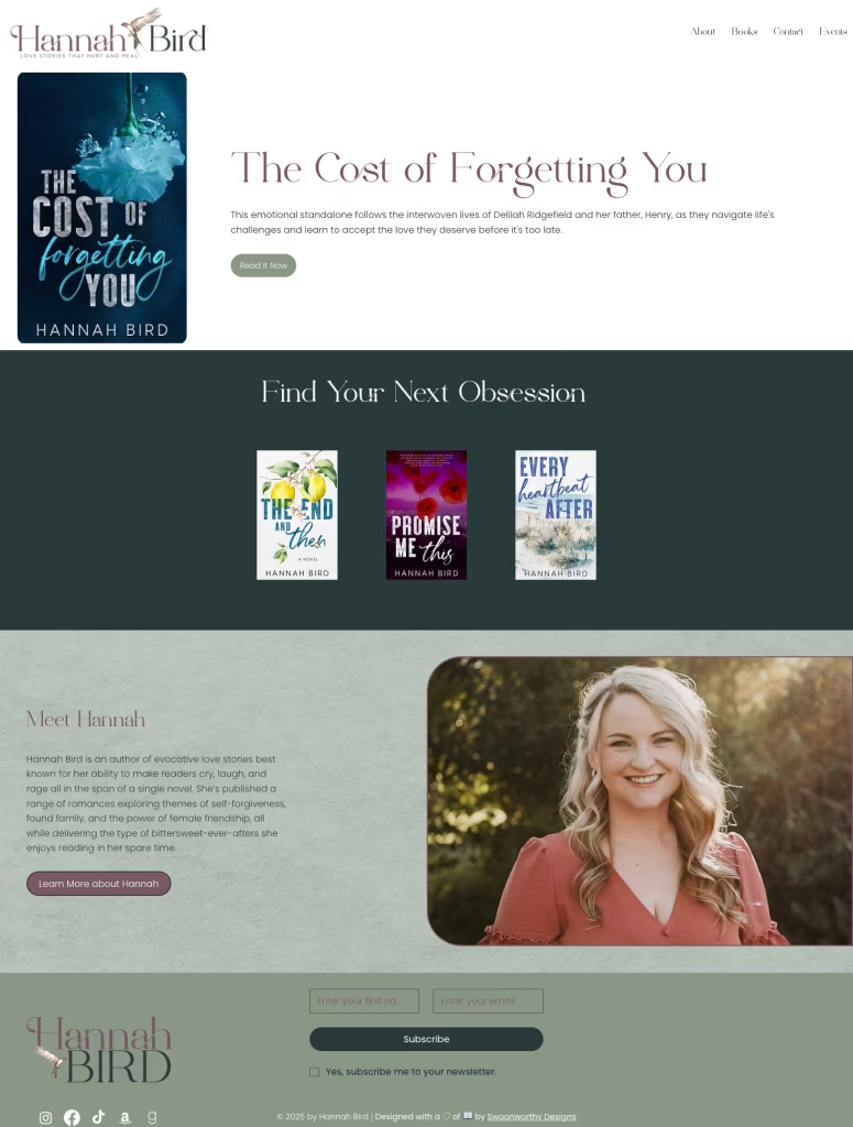
2. Hannah Bird – Soft, Swoony, and Exactly Right
The Challenge: Hannah writes contemporary romance that makes you cry (the good kind of crying). She needed a website that felt as warm and emotional as her stories about found family and second chances.
What We Built: Soft sage greens, elegant typography, and a layout that feels like a warm hug. The homepage immediately showcases her latest release while making it easy to find your next binge-read.
The Magic Moment: The “Find Your Next Obsession” section that displays her books beautifully without overwhelming visitors.
Why It Works: It’s clean, it’s navigable, and it feels like Hannah. When readers land here, they immediately know what kind of emotional journey they’re signing up for.

3. Charlie Cochet – Bold, Colorful, and Unapologetically Queer
The Challenge: Charlie writes LGBTQ+ romance with humor, heart, and a whole lot of personality. Her old site wasn’t reflecting the vibrant, fun energy of her stories or her as an author.
What We Built: We created a full brand identity (yes, those teal and pink colors? All part of the strategy) and then built a site that’s as bold as her books. Bright colors, playful elements, and clear calls-to-action throughout.
The Magic Moment: The homepage immediately draws you in with her latest release, then invites you to “Find Your Next Binge-Read” – perfect for her series-loving fans.
Why It Works: It’s fun, it’s functional, and it speaks directly to her audience. Plus, the navigation is crystal clear – no one’s getting lost trying to figure out reading order.
4. AJ Alexander – Small-Town Sweetness Done Right
The Challenge: AJ writes small-town contemporary romance with all the feels. She needed a site that captured that cozy, heartwarming vibe while making it easy for readers to dive into her world.
What We Built: We handled both branding and web design for this project (sensing a theme here?). Soft pinks, handwritten-style fonts, and a layout that immediately makes you want to curl up with one of her books. The site’s launching soon, and we can’t wait for you to see it.
The Magic Moment: The tagline “Messy emotions, big heart energy” paired with a sticky note aesthetic that screams small-town charm.
Why It Works: It feels authentic to AJ’s voice while being super easy to navigate. The Polaroid-style book displays add that perfect personal touch.


5. Love on Demand – Building a Romance Community Brand
The Challenge: This wasn’t your typical author site – Love on Demand is a romance news and entertainment platform that needed to feel professional, engaging, and community-focused all at once.
What We Built: A vibrant, modern site with bold pink and blue branding that immediately catches the eye. We created a platform that showcases events, articles, and connects romance readers with the content they crave.
The Magic Moment: The events calendar that shows upcoming romance conventions and signings – making it a true resource hub for romance fans.
Why It Works: It’s not trying to be everything to everyone. It knows exactly what it is: a place for romance readers to stay connected, informed, and excited about the genre.
6. Claudia Burgoa – When Your Store IS Your Brand
The Challenge: Claudia needed more than just a website – she needed a fully functioning Shopify store that could handle paperbacks, special editions, audiobooks, and merchandise while still feeling elegant and on-brand.
What We Built: A sophisticated Shopify store with soft pink tones and clean layouts. “Find Your Next Book Boyfriend” isn’t just a tagline – it’s an invitation. We organized everything by series, making it easy for new readers to jump in anywhere.
The Magic Moment: The testimonial section featuring 5-star reader reviews right on the homepage. Social proof done right.
Why It Works: It’s a store that doesn’t feel like a store. It feels like shopping at your favorite indie bookshop, except it’s all Claudia’s books and you can do it in your pajamas.


7. Ellie Wade – Purple Passion and Perfect Organization
The Challenge: Ellie has a substantial backlist, and her readers needed an easier way to navigate all her books. Plus, she wanted to announce new releases in a way that felt exciting, not overwhelming.
What We Built: A purple and pink paradise with clear sections for different series. The homepage immediately highlights what’s new, while making it simple to explore her entire catalog.
The Magic Moment: The “What’s Next?” section that keeps readers engaged and coming back. Plus, that newsletter signup with the promise of surprises? Chef’s kiss.
Why It Works: Organization meets personality. You can find exactly what you want without feeling like you’re drowning in options.
8. Ashley Munoz – Cozy Shop Vibes for the Win
The Challenge: Ashley wanted a shop that felt less like a transaction and more like an experience. She needed to sell books and merchandise while maintaining that warm, personal touch her readers love.
What We Built: A Shopify store with soft, muted tones (those peachy pinks and sage greens!) and a layout that invites browsing. We highlighted her holiday romance release while making sure the rest of her backlist was easy to explore.
The Magic Moment: The homepage greeting – “Hey, it’s Ashley!” – followed by a personal welcome that makes every visitor feel like they’re shopping with a friend.
Why It Works: It’s approachable, it’s organized, and it makes buying directly from Ashley feel like the obvious choice.


9. Elizabeth O’Roark – Bold, Bright, and Beautifully Simple
The Challenge: Elizabeth writes contemporary romance with sharp wit and emotional depth. She needed a store that could showcase her special editions (those covers! 😍) while making regular editions easily accessible too.
What We Built: A Shopify store with vibrant gradient backgrounds (hello, orange and pink and purple!) and clean product displays. We made sure those gorgeous special edition covers got the spotlight they deserved.
The Magic Moment: The product grid that lets those colorful covers shine. Sometimes the books themselves are the best design element.
Why It Works: It’s visually striking without being busy. Your eye knows exactly where to go, and the shopping experience is seamless.
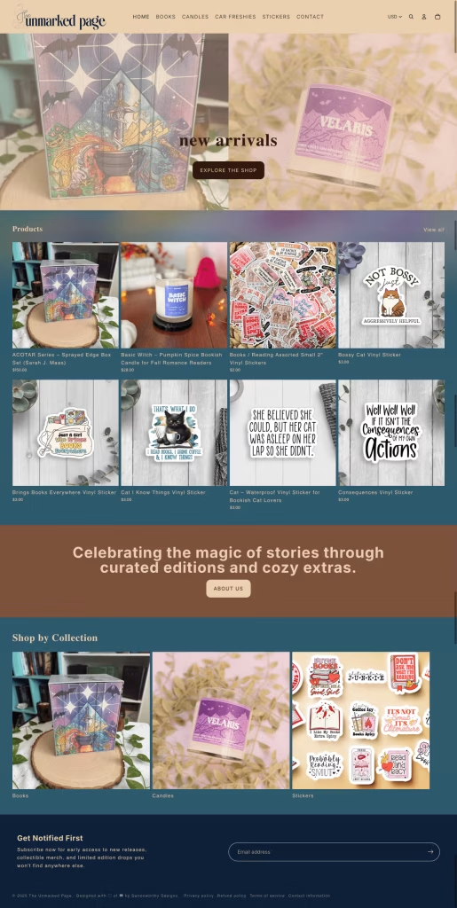
10. The Unmarked Page – A Literary Boutique Done Right
The Challenge: This wasn’t just about selling books – it was about creating a full retail experience. Books, candles, stickers, merchandise… all needing to feel cohesive and curated.
What We Built: A Shopify store that truly functions as a boutique. We organized products by collection (books, candles, stickers), created that gorgeous “celebrating the magic of stories through curated editions and cozy extras” tagline, and made sure every product felt special.
The Magic Moment: The “Shop by Collection” section that makes browsing feel intentional rather than overwhelming.
Why It Works: It positions books as part of a larger lifestyle brand. You’re not just buying a book – you’re buying into an experience.
What These Transformations Have in Common
Looking at these 10 projects, a few patterns emerge:
1. Brand Before Build Notice how many of these included branding work? That’s not a coincidence. Your website can’t represent your brand if you don’t have a clear brand to represent.
2. Genre Awareness Every single one of these sites knows what genre it’s serving. Dark fantasy looks different from small-town contemporary, and that’s exactly how it should be.
3. Reader-First Design These sites aren’t built to impress other designers. They’re built to convert readers. Clear navigation, obvious calls-to-action, and easy purchasing options throughout.
4. Email List Priority Every single site makes it easy (and appealing) to join the email list. Because we all know: your email list is your career insurance policy.
5. Authenticity Over Perfection None of these sites are trying to be something they’re not. They’re genuine reflections of the authors behind them.
Ready to Be on Next Year’s List?
Here’s the thing about these transformations: they didn’t happen by accident. Every author who reached out was ready to invest in their career. They were tired of DIY attempts that looked DIY. They wanted something that actually worked.
And now? They have websites that are actively selling books, growing lists, and making their lives easier.
If you’ve been thinking “maybe next year” about finally getting a website that actually represents your brand…
2026 is next year.
And we’re already booking projects.
Want to see your site on next year’s roundup? Schedule your Meet Cute call and let’s talk about what’s possible for your author brand.
Because honestly? We can’t wait to see what we build together in 2026.